Chapter 3 · Build your form
Design
Customize your form's look and feel in the Formfacade Preview tab: choose a Minimal or Colorful theme, set colors, background, and fonts, add your branding, and preview live before publishing.
Quick Answer
How do I customize how my Formfacade form looks?
Open the Preview tab. Pick a base theme (Minimal or Colorful), then choose a color preset, set your primary and background colors, add a background image or make it transparent, and set fonts and size. Use the Page tab to add a logo, business name, and footer. Preview on desktop or mobile, then click Apply to save.
Once your form is structured in the editor, the Preview tab is where you customize its look and feel, one of Formfacade's core selling points. Choose a theme, set your colors and fonts, add your branding, and see the result live before you publish.
Entering Preview & the page-title prompt
If your site doesn't have a business name yet, opening Preview first asks whether to change the default page title:
- Yes → opens the Page tab to set your branding (logo, business name, footer, language).
- No → stays on the Theme tab so you can start styling right away.
The right panel has three tabs: Theme (the form's visual style), Layout (Compact, Comfortable, or Default), and Page (site-level branding).
Preview modes
At any time you can preview the form as it will really appear:
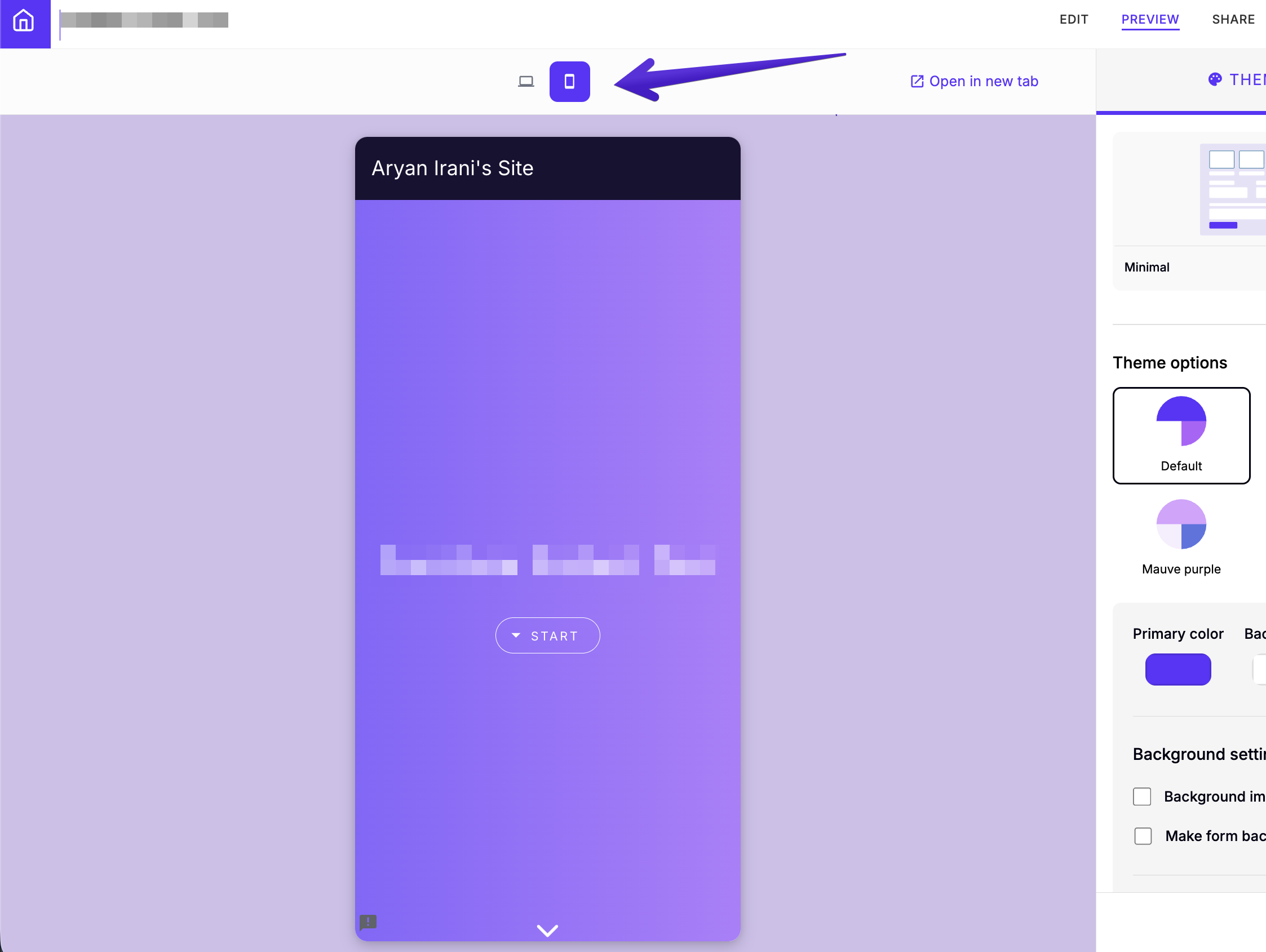
- Desktop / Mobile: toggle between the two device widths.
- Open in new tab: see the full, live form on its own.
Theme: Minimal vs Colorful
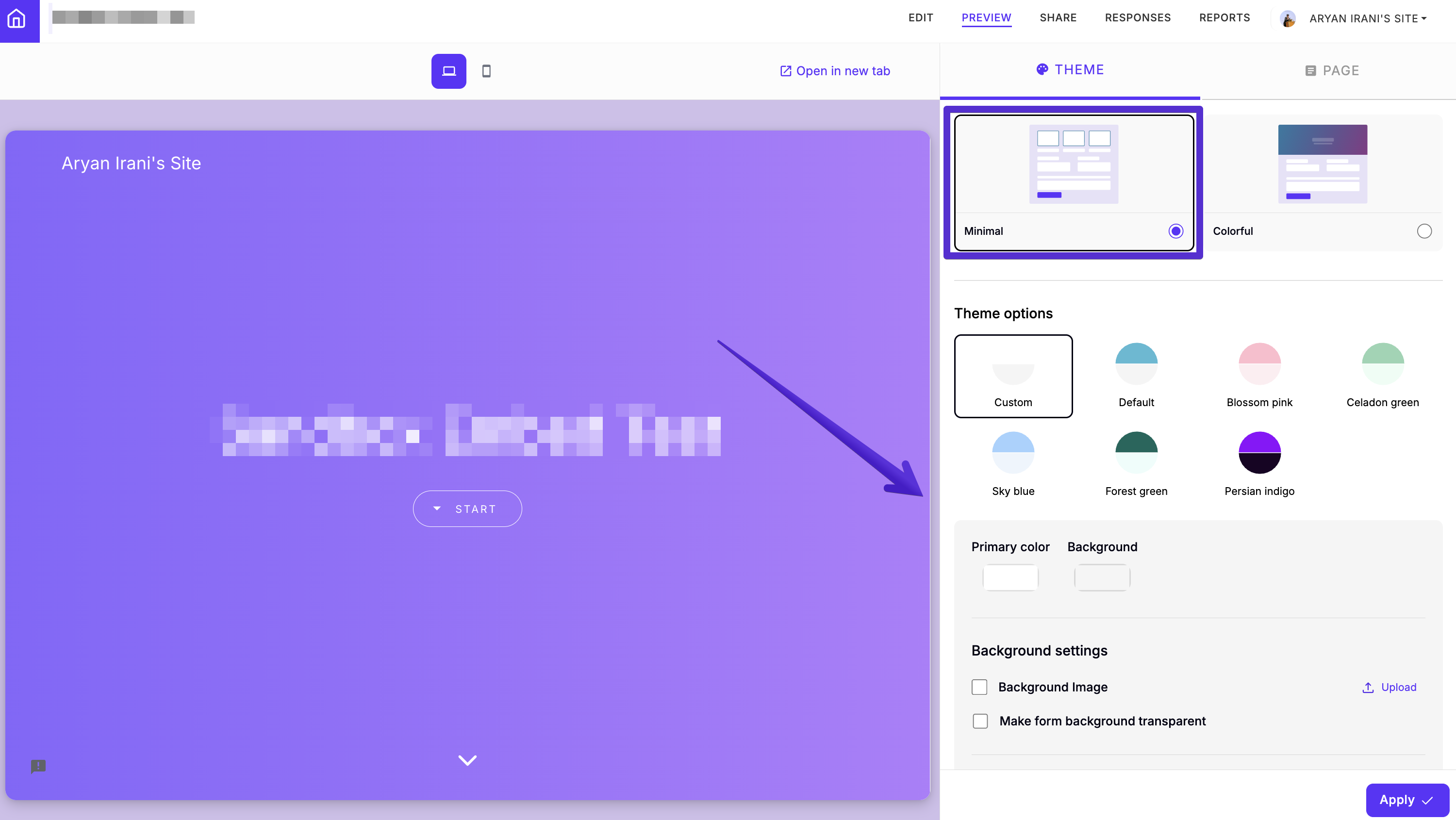
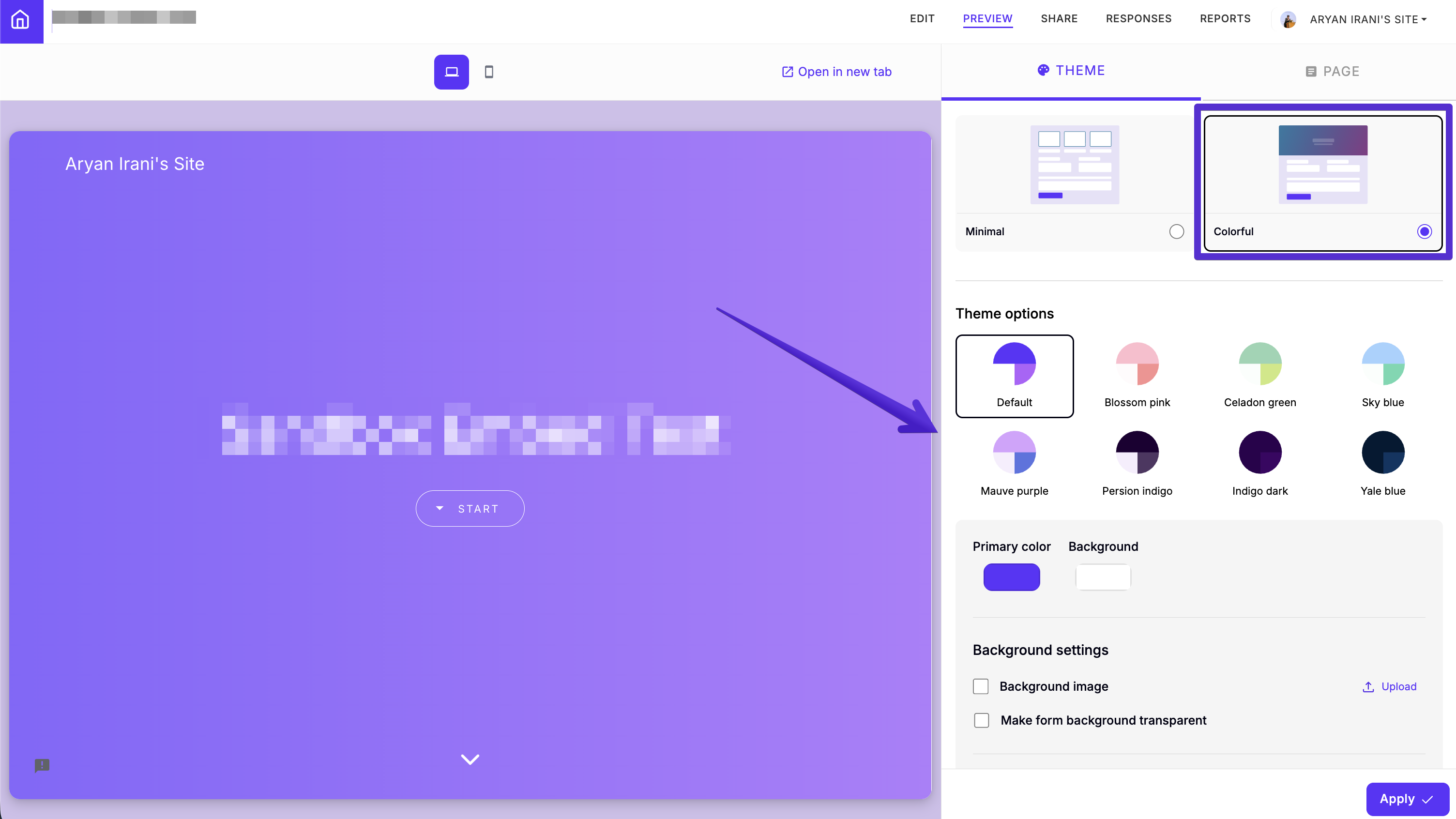
The Theme tab starts with two base themes. Both expose the same controls (presets, colors, background, and typography); they just start from a different look:
| Minimal | Colorful | |
|---|---|---|
| Look | Clean, light, understated | Bold, with a colored header band and richer palettes |
| Best for | Blending into an existing site | Making the form a branded centerpiece |
| Presets | Custom, Default, Blossom pink, Celadon green, Sky blue, Forest green, Persian indigo | Default, Blossom pink, Celadon green, Sky blue, Mauve purple, Persian indigo, Indigo dark, Yale blue |
Whichever base you pick, the controls below work the same way.
Theme options (presets)
Pick a ready-made palette, or choose Custom to define your own. Colorful adds several deeper options (Mauve purple, Indigo dark, Yale blue) for a more vivid look.
Colors
Set the Primary color (buttons, accents) and the Background. Match these to your brand's palette.
Background settings
- Background image: upload your own image behind the form.
- Make form background transparent: let the form blend into the page or site it's embedded on.
Typography settings
Choose separate fonts for Headings and Paragraph text, and set the overall Font size with the slider (Smaller → Larger).
Page (branding)
The Page tab sets your brand details, shown around the form:
| Field | What it sets |
|---|---|
| Logo | Upload a logo (PNG, JPG, or WebP) |
| Business name | Your name as it appears in branding |
| Footer | Footer text, e.g. copyright info |
| Language | The form's display language |
Apply your changes
Always click Apply
Whatever you change (theme, colors, background, fonts, or branding), you must click Apply to save it to your form. Nothing takes effect until you do.
How to modify styles using CSS?
When the theme options don't go far enough, add your own CSS:
- Open the Edit tab and click the form's title.
- Click the gear icon (⚙️) and open the Advanced tab.
- Paste your CSS into Custom CSS and click Save.
Formfacade's elements have ff- class names, such as .ff-title for the
form's title. Right-click an element on your form and choose Inspect to
find its class. For a worked example, read
How to modify styles using CSS in a Google Form.
Next steps
- Share or embed your styled form from Share your form.
- Change what happens after submit: After submit.